TidyTuesday 2020 week 44
ggplot2
gganimate
spatial
data visualization
tidytuesday
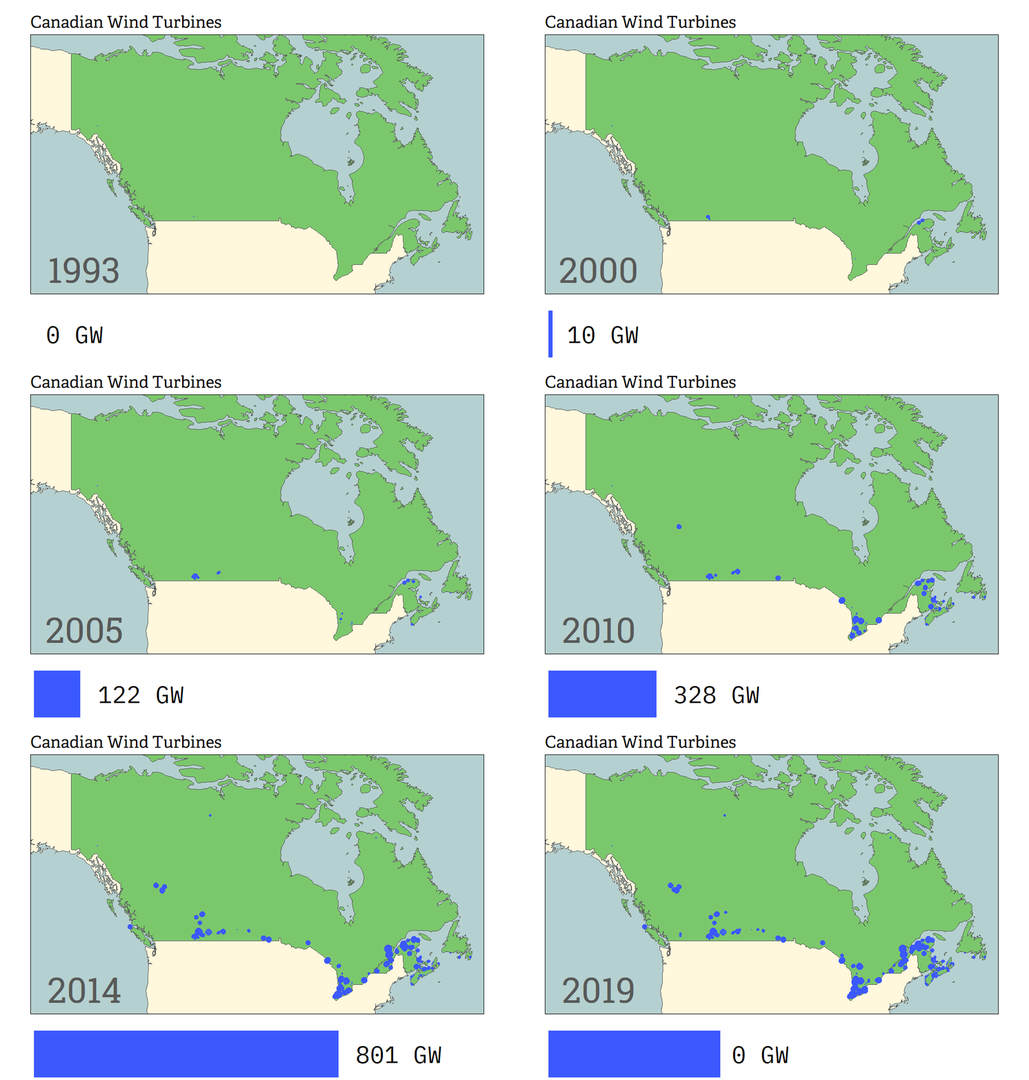
Patched animation of the location and cumulative capacity of wind turbines in Canada
June Choe 
Visualization
Things I learned
Things to improve
I couldn’t figure out how to add margins to the bottom, but I now realize that I could’ve just played around with
expansion()for the y-axis of the bar animation plot.Image composition took a while to render, which was a bit frustrating. Need to find a way to speed that up.
Code
Also available on github
library(tidyverse)
library(gganimate)
library(extrafont)

tuesdata <- tidytuesdayR::tt_load(2020, week = 44)

wind_turbine <- tuesdata$`wind-turbine` %>%
  select(
    ID = objectid,
    Province = province_territory,
    Capacity = total_project_capacity_mw,
    Diameter = rotor_diameter_m,
    Height = hub_height_m,
    Year = commissioning_date,
    Lat = latitude,
    Lon = longitude
  ) %>%
  arrange(Year, -Diameter) %>%
  mutate(
    Year = as.integer(str_match(Year, "^\\d{4}")[,1])
  )


ne_map <- rnaturalearth::ne_countries(scale='medium', returnclass = 'sf')

turbine_anim <- wind_turbine %>%
  ggplot() +
  geom_rect(
    aes(xmin = -150, xmax = -50, ymin = 40, ymax = 72),
    fill = "#B6D0D1"
  ) +
  geom_sf(
    aes(fill = ifelse(admin == "Canada", "#7BC86C", "#FFF8DC")),
    show.legend = FALSE,
    data = filter(ne_map, admin %in% c("Canada", "United States of America"))
  ) +
  scale_fill_identity() +
  geom_point(
    aes(Lon, Lat, group = ID, size = Capacity),
    show.legend = FALSE, alpha = 0.5, color = "#3C59FF"
  ) +
  geom_text(
    aes(x = -138, y = 43, label = as.character(Year)),
    size = 24, color = "grey35", family = "Roboto Slab"
  ) +
  geom_rect(
    aes(xmin = -150, xmax = -50, ymin = 40, ymax = 72),
    fill = "transparent", color = "black"
  ) +
  coord_sf(
    xlim = c(-150, -50),
    ylim = c(40, 72),
    expand = FALSE,
    clip = "on"
  ) +
  ggtitle("Canadian Wind Turbines") +
  theme_void() +
  theme(
    plot.title = element_text(family = "Adelle", s),
    plot.margin = margin(1, 1, 1, 1, "cm")
  ) +
  transition_reveal(Year)

animate(turbine_anim, width = 1000, height = 600, nframes = 100)


capacity_data <- wind_turbine %>%
  group_by(Year) %>%
  summarize(
    Capacity = sum(Capacity),
    .groups = 'drop'
  ) %>%
  mutate(
    Capacity = accumulate(Capacity, sum),
    width = (Capacity/max(Capacity)) * 70
  )

capacity_anim <- capacity_data %>%
  ggplot(aes(x = 1, y = Capacity)) +
  geom_col(
    fill = "#3C59FF",
  ) +
  geom_text(
    aes(label = paste(as.character(round(Capacity * 0.001)), "GW")),
    hjust = -.2,
    family = "IBM Plex Mono"
  ) +
  scale_y_continuous(expand = expansion(c(.1, .4))) +
  coord_flip() +
  theme_void() +
  transition_states(Year)

animate(capacity_anim, res = 300, width = 1000, height = 100, nframes = 100)


library(magick)

map_gif <- image_read("turbine_map.gif")
bar_gif <- image_read("capacity_bar.gif")

new_gif <- image_append(c(map_gif[1], bar_gif[1]), stack = TRUE)

for(i in 2:100){
  combined <- image_append(c(map_gif[i], bar_gif[i]), stack = TRUE)
  new_gif <- c(new_gif, combined)
}

new_gif
Footnotes
If I don’t count all the convenient US-centric data/packages I’ve used to plot American maps before, this would be the first map I’ve made from scratch.↩︎
Citation
BibTeX citation:
@online{choe2020,
  author = {Choe, June},
  title = {TidyTuesday 2020 Week 44},
  date = {2020-10-28},
  url = {https://yjunechoe.github.io/posts/2020-10-28-tidytuesday-2020-week-44/},
  langid = {en}
}
For attribution, please cite this work as:
Choe, June. 2020. “TidyTuesday 2020 Week 44.” October 28.
https://yjunechoe.github.io/posts/2020-10-28-tidytuesday-2020-week-44/.