Plot Makeover #1
June Choe 
This is the first installment of plot makeover where I take a plot in the wild and make very opinionated modifications to it.
Before
Our plot-in-the-wild comes from the recent AMLAP 2020 conference, where I presented my thesis research and had the opportunity to talk with and listen to expert psycholinguists around the world. The plot that I’ll be looking at here is Figure 3 from the abstract of a work by E. Matthew Husband and Nikole Patson (Husband and Patson 2020).
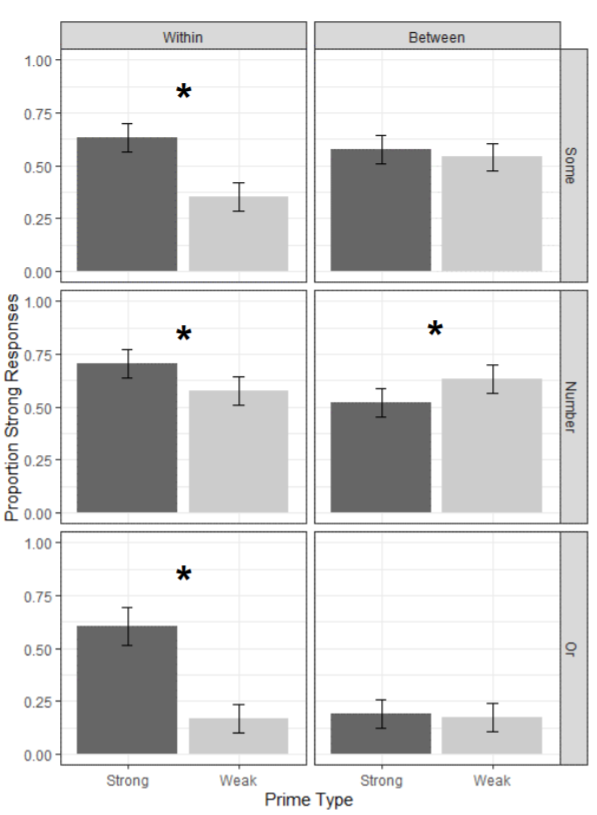
Figure 1: Plot from Husband and Patson (2020)
What we have is 6 pairs of barplots with error bars, laid out in a 2-by-3 grid. The total of 12 bars are grouped at three levels which are mapped in the following way:
First level is mapped to the grid column.
Second level is mapped to the grid row.
Third level is mapped to the x-axis.
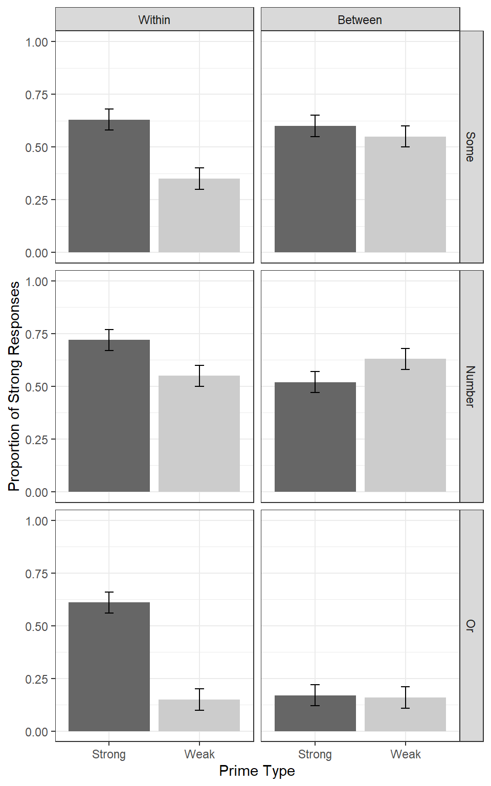
To get a better sense of what they did, and to make data for the plot makeover, I have recreated the original plot below:1
1. Data
barheight were eyeballed from looking at the original plot, of course.
  # A tibble: 12 x 4
     level_1 level_2 level_3 barheight
     <fct>   <fct>   <fct>       <dbl>
   1 Within  Some    Strong       0.63
   2 Within  Some    Weak         0.35
   3 Within  Number  Strong       0.72
   4 Within  Number  Weak         0.55
   5 Within  Or      Strong       0.61
   6 Within  Or      Weak         0.15
   7 Between Some    Strong       0.6
   8 Between Some    Weak         0.55
   9 Between Number  Strong       0.52
  10 Between Number  Weak         0.63
  11 Between Or      Strong       0.17
  12 Between Or      Weak         0.16
2. Plot
df %>%
  ggplot(aes(level_3, barheight)) +
  geom_col(
    aes(fill = level_3),
    show.legend = FALSE
  ) +
  geom_errorbar(
    aes(ymin = barheight - .05, ymax = barheight + .05),
    width = .1) +
  facet_grid(level_2 ~ level_1) +
  theme_bw() +
  scale_fill_manual(values = c('grey40', 'grey80')) +
  ylim(0, 1) +
  labs(
    y = "Proportion of Strong Responses",
    x = "Prime Type") +
  theme_bw()
My Plan
Major Changes:
Flatten the grid in some way so that everything is laid out left-to-right and you can make comparisons horizontally.
Cap the y axis to make it clear that the values (proportions) can only lie between 0 and 1.
Minor Changes:
Remove grid lines
Increase space between axis and axis titles.
Remove boxes around strip labels
Make strip (facet) labels larger and more readable.
Increase letter spacing (probably by changing font)
After
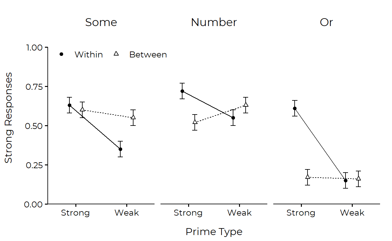
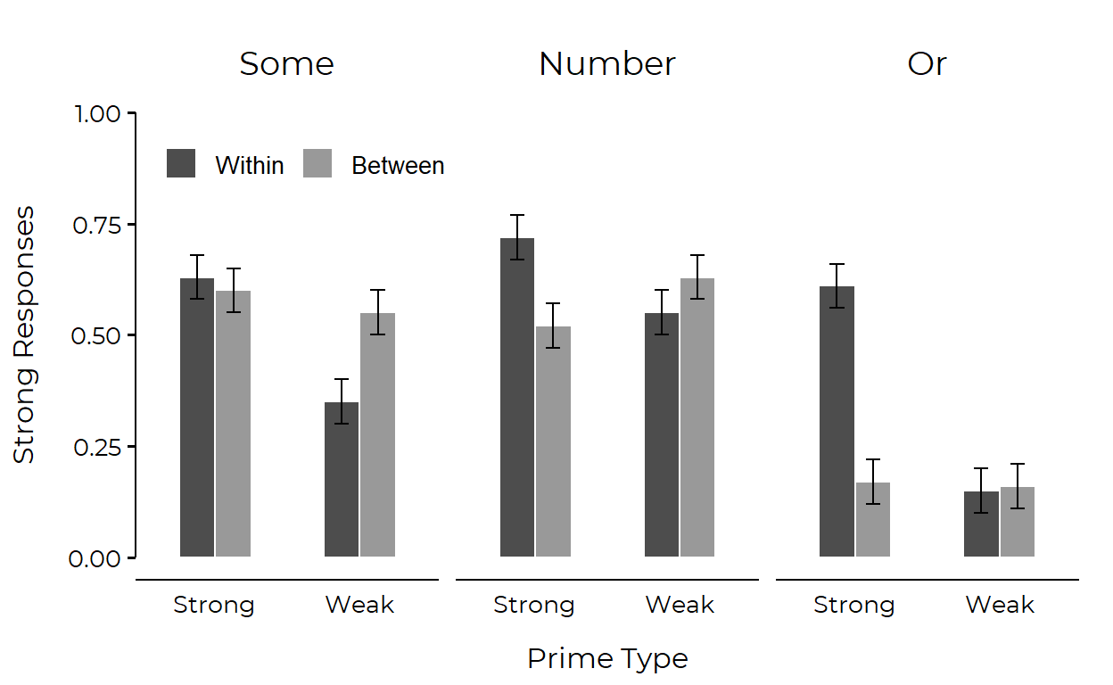
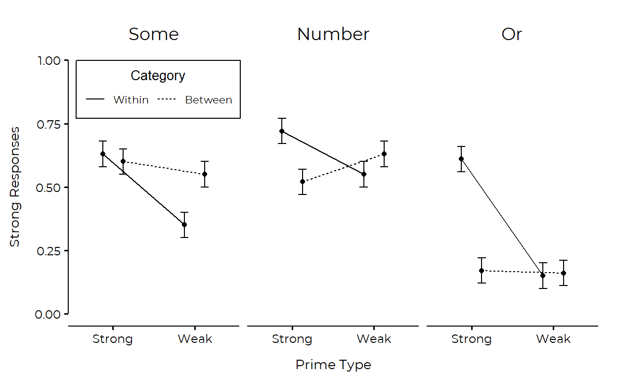
I actually couldn’t settle on one final product2 so here are two plots that incorporate the changes that I wanted to make. I think that both look nice and you may prefer one style over the other depending on what relationships/comparisons you want your graph to emphasize.
Point-line plot
I got a suggestion that the groups could additionally be mapped to shape for greater clarity, so I’ve incorporated that change.3
dodge <- position_dodge(width = .5)

df %>%
  mutate(level_3 = as.numeric(level_3)) %>%
  ggplot(aes(x = level_3, y = barheight, group = level_1)) +
  geom_errorbar(
    aes(ymin = barheight - .05, ymax = barheight + .05),
    width = .2,
    position = dodge
  ) +
  geom_line(
    aes(linetype = level_1),
    position = dodge,
    show.legend = FALSE
  ) +
  geom_point(
    aes(shape = level_1, fill = level_1),
    size = 1.5,
    stroke = .6,
    position = dodge
  ) +
  scale_fill_manual(values = c("black", "white")) +
  scale_shape_manual(values = c(21, 24)) +
  facet_wrap(~ level_2) +
  scale_x_continuous(
    breaks = 1:2,
    labels = levels(df$level_3),
    expand = expansion(.2),
  ) +
  scale_y_continuous(
    limits = c(0, 1),
    expand = expansion(c(0, .1))
  ) +
  lemon::coord_capped_cart(left = "both") +
  guides(
    fill = guide_none(),
    shape = guide_legend(
      title = NULL,
      direction = "horizontal",
      label.theme = element_text(size = 10, family = "Montserrat"),
      override.aes = list(fill = c("black", "white"))
    )
  ) +
  labs(
    y = "Strong Responses",
    x = "Prime Type",
    linetype = "Category"
  ) +
  ggthemes::theme_clean(base_size = 14) +
  theme(
    text = element_text(family = "Montserrat"),
    legend.position = c(.18, .87),
    legend.background = element_rect(color = NA, fill = NA),
    strip.text = element_text(size = 13),
    plot.margin = margin(5, 5, 5, 5, 'mm'),
    axis.title.x = element_text(vjust = -3),
    axis.title.y = element_text(vjust = 5),
    plot.background = element_blank(),
    panel.grid.major.y = element_blank()
  )
Bar plot
dodge <- position_dodge(width = .5)

df %>%
  mutate(level_3 = as.numeric(level_3)) %>%
  ggplot(aes(x = level_3, y = barheight, group = level_1)) +
  geom_col(position = dodge, width = .5, color = 'white', aes(fill = level_1)) +
  scale_fill_manual(values = c("grey30", "grey60")) +
  geom_errorbar(
    aes(ymin = barheight - .05, ymax = barheight + .05),
    width = .2,
    position = dodge
  ) +
  facet_wrap(~ level_2) +
  scale_x_continuous(
    breaks = 1:2,
    labels = levels(df$level_3),
    expand = expansion(.2),
  ) +
  ylim(0, 1) +
  lemon::coord_capped_cart(left = "both") +
  labs(
    y = "Strong Responses",
    x = "Prime Type",
    fill = NULL
  ) +
  ggthemes::theme_clean(base_size=14) +
  theme(
    text = element_text(family = "Montserrat"),
    legend.text = element_text(size = 10),
    legend.key.size = unit(5, 'mm'),
    legend.direction = "horizontal",
    legend.position = c(.17, .85),
    legend.background = element_blank(),
    strip.text = element_text(size = 14),
    axis.ticks.x = element_blank(),
    axis.title.x = element_text(vjust = -3),
    axis.title.y = element_text(vjust = 5),
    panel.grid.major.y = element_blank(),
    plot.background = element_blank(),
    plot.margin = margin(5, 5, 5, 5, 'mm')
  )
guides() and distributed its arguments across labs() and theme(). I kinda like this layout of having a fat theme(). It’s also not too hard to read if you group and sort the arguments.
References
Footnotes
But note that this is likely not how the original plot was generated: the authors were likely feeding ggplot2 with the raw data (involving 1s and 0s in this case), but here I am just grabbing the summary statistic that was mapped to the bar aesthetic (hence my decision to name the y variable
barheight).↩︎I ran the first plot by a friend who has a degree in design, and she recommended several changes that eventually ended up being the second plot. Some major pointers were removing border lines from the legend, removing x-axis tick marks, and applying color/shade.↩︎
The plot used to look like this:
 ↩︎
↩︎
Citation
@online{choe2020,
  author = {Choe, June},
  title = {Plot {Makeover} \#1},
  date = {2020-09-20},
  url = {https://yjunechoe.github.io/posts/2020-09-20-plot-makeover-1/},
  langid = {en}
}