Installation
You can install the development version from GitHub with:
# install.packages("remotes")
remotes::install_github("yjunechoe/ggtrace")
More on the 📦 package website: https://yjunechoe.github.io/ggtrace
Getting started
ggtrace is a functional interface to ggplot2 internals. You need to know a little bit about ggplot2 internals to make the most out of ggtrace.
If you prefer watching videos, here are three talks on the topic in increasing complexity:
Motivation
Broadly speaking, ggtrace was designed with two goals in mind:
1. Understanding Sublayer Modularity
To help users write more expressive layer code using delayed aesthetic evaluation. The family of layer_*() extractor functions return snapshots of layer data in the internals, to help scaffold a mental model of ggplot2 internals as a data wrangling pipeline. See ?`sublayer-data`

2. Facilitating the User-Developer Transition
To empower users to start developing their own extensions This is achieved via a family of inspect_*(), capture_*(), and highjack_*() workflow functions, which provide a functional interface into the object-oriented design of the internals (the <ggproto> OOP).

You can read the full motivation behind ggtrace in the Pedagogical Philosophy vignette.
Playground
The best way to learn ggtrace and ggplot2 internals is by playing around and breaking things as you go.
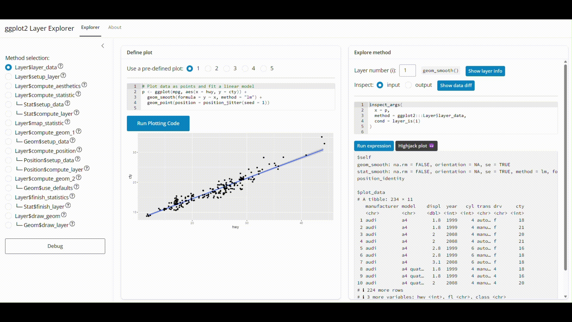
In that spirit, you can take ggtrace for a spin on the ggplot2 layer explorer.
🚀 Live App: https://yjunechoe.github.io/ggplot2-layer-explorer/
🔗 Repo: https://github.com/yjunechoe/ggplot2-layer-explorer